Camera: Canon EOS 5DS R
Lens: Canon EF100-400mm f/4.5-5.6L IS II USM, with a focal length at 400 mm
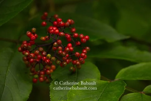
f/11, 1/80 second, ISO 1600
Participants to my photo workshops often ask me about my thought process when I shoot. In this case the first thing I noticed, while walking in the forest, were the red berries and green foliage. When we look at a photograph or a painting, our eyes are unconsciously attracted to elements in red in the overall composition. In addition, red and green are opposite to each other in the wheel of colour, they are complementary colours like blue and orange, and yellow and violet. The use of complementary colours in photography creates a bold image.
My next step consisted of framing my subject so I moved around it to find the best angle. Should I look down, look up, be at eye-level, where is the light coming from? I also took into consideration distracting elements such as bright areas, leading lines, branches, damaged foliage, etc. I chose a telephoto lens to isolate my subject and I used a tripod for stability. Next I thought about the mood of my image and determined the depth of field, aperture and shutter speed. I chose to underexpose by one full stop. I also used a polarizing filter to suppress the reflection of light on the shiny surface of the berries.
In conclusion, I prefer to take my time in the field than spending hours in front of my computer screen trying to fix my mistakes. Afterall I love nature much more than my computer!
If you would like to learn more about my photo workshops, please contact me. I will be more than happy to help you hone your skills in nature and wildlife photography.

